Have you ever noticed that when you look at the fine print on labels, it’s difficult to make out individual words? No matter how hard you squint, each word stubbornly won’t come into focus. I went to an optometrist recently after noticing this, only to be told that once you turn forty, the lenses in your eyes start to deteriorate. To add insult to injury, last year I found out I have 50% hearing loss and require hearing aids. The joys of aging!
Working remotely, I’ve come to appreciate just how important web accessibility is for everyone, not just for people under forty who have perfect eye-site, hearing and mobility. Whether it’s reading an article, using social media, enrolling in a course, hosting a virtual meeting or doing online shopping, a large portion of our lives are tied to technology and living without it has become almost impossible.
There are roughly 1.6 billion Internet users worldwide who have some form of disability, whether that be visual, auditory, motor, or cognitive impairments. There is also a large section of society who are not classified as disabled, yet could benefit from some form of assistive technology. While web accessibility is not a new concept, it’s more relevant now than ever - yet the digital world is still far from being a level playing field.
In 2023, a WebAIM study found that 96% of the world’s top one million web pages had accessibility issues - the most common errors being low-contrast text, missing alternative text for images, empty links, missing form input labels, and empty buttons. Whilst government, health and social media platforms have improved since 2019, e-commerce sites have gone backwards. Not only has this resulted in billions of dollars in lost revenue, but it has also led to an uptick in litigation. In 2022, the United States saw 4,060 web accessibility lawsuits, a 76% increase from 2018.
One such case was Robles Vs. Dominos Pizza (2022). Robles filed a lawsuit in 2016 claiming that the Domino’s website and app was not compatible with his screen reader. While he initially lost the case, a Court of Appeals eventually ruled in his favour, stating that “websites and apps must provide effective communication and facilitate ‘full and equal enjoyment’ to its customers who are disabled.” This was a major win for disability advocates and a wake-up call for big business.
Web Content Accessibility Guidelines
The Web Content Accessibility Guidelines (WCAG) are a worldwide technical accessibility standard. Australia, New Zealand, the US and the UK are amongst a growing list of countries who have signed up to it. WCAG 1.0 was first developed by the World Wide Web Consortium (W3C) in 1999. WCAG 2.0 was released in 2008 and WCAG 2.1 in 2018. The guidelines are aimed at a broad audience including Web developers & designers, business leaders, educational institutions, government agencies and content creators. They are based on four principles:
1. Perceivable
Information and UI components must be presented in ways users can perceive (e.g., providing text alternatives for non-text content).
2. Operable
The interface should be functional via various input methods, including keyboards and assistive technologies.
3. Understandable
Content and navigation should be clear and predictable.
4. Robust
Content should be accessible across different devices and assistive technologies.
Improving Accessibility for Your Business
Adopting WCAG standards can help organisations in a variety of ways. Proper heading structures, alternative text, and readable content improves Search Engine Optimisation (SEO), leading to higher search rankings and increased traffic, while a better user experience can only improve a company’s branding and reputation.
Achieving WCAG compliance can be relatively straightforward. There are free Evaluation Tools that analyse web pages and highlight accessibility issues. This can be a great starting point for understanding what needs to be done.
Below are some of the most common features that make a website accessible:
Alternative Text for Images
Screen readers rely on alternative (ALT) text to describe images for visually impaired users.
The below image shows examples of suitable and unsuitable ALT text.
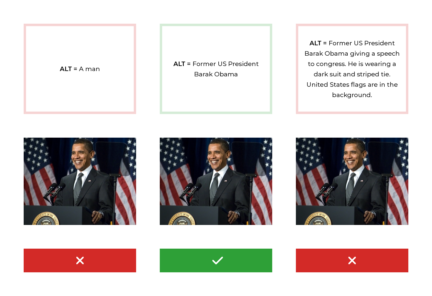
Tip
No ALT Text for images is one of the biggest accessibility fails. When adding a description, only include essential information. Note – ALT text is not required for purely decorative images and graphics.
Provide Keyboard-Friendly Navigation
Users should be able to navigate through a website or learning platform without using a mouse.
Try the following experiment. Head to the Bureau of Meteorology (BOM) website and see how easy or difficult it is to navigate it using only a keyboard.
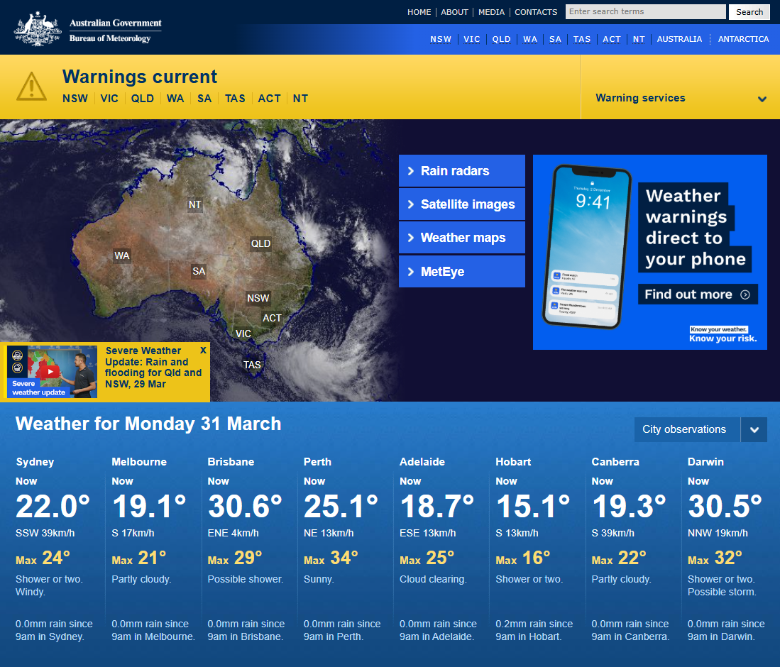
Tip
Using a keyboard to navigate a website can be extremely frustrating, especially when the page uses a grid or column format. Watch out for keyboard traps, ensure the focus state is visible at all times, be mindful when using pop-ups and make sure all elements on the page can be accessed.
Captions and Transcripts
Videos should have captions and transcripts to accommodate hearing impaired users.

Note that unlike subtitles, captions include all sound effects.
Tip
With regards to captions, there are software which can create captions automatically; however, they are not always accurate, particularly with synching, so it pays to double check. As a rule, captions should be closed (CC) meaning they can be turned on or off depending on the need.
In terms of transcripts, there are options for a text version of the audio which allows deaf/blind users to access the content using Braille devices. It also allows users to read at their own pace. This makes transcripts ideal for educational products and pre-recorded podcasts.
Colour Contrast and Readability
Text should be readable against background colours. Colour should not be the sole means of conveying information.
Tip 1
There are several contrast checkers that are based on WCAG AA and AAA standards. When designing content, be wary of background colours, especially for infographics.
The below image depicts a sample infographic, and the analysis conducted via the WebAIM contrast checker with regards to the text and the background colours.

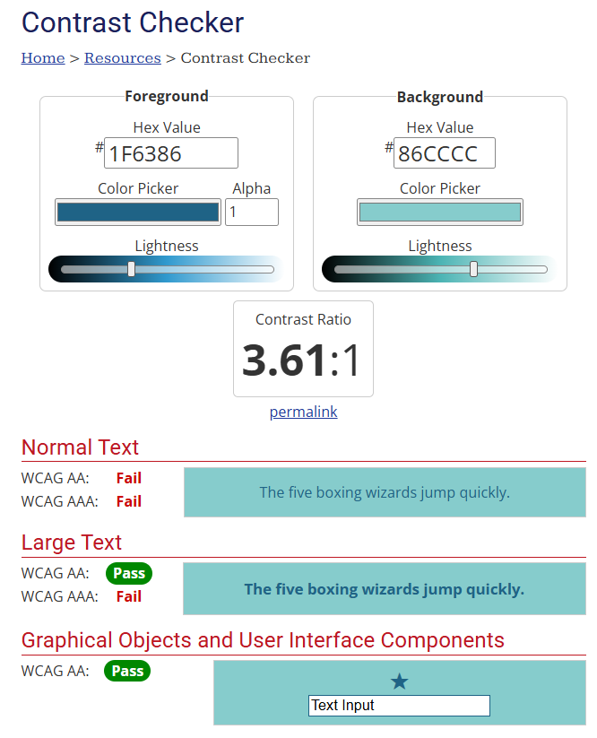
Tip 2
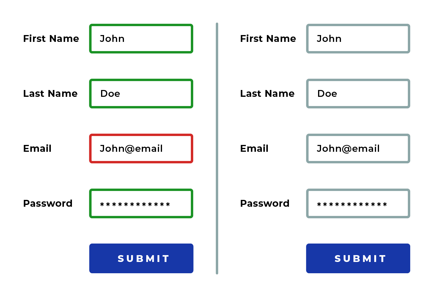
Use symbols and/or words as well as colour to convey meaning. For example, don’t use red alone to indicate a mistake, use a cross or the word ‘incorrect or error’ as well. This is a common mistake for online forms and e-learning assessments.
Note that in the pictures below, there would be no difference for a colour blind user.
Content structure with Headings and Landmarks
Content with descriptive headings and page elements allows screen readers to interpret and navigate the site efficiently.
Tip
Heading levels dictate the hierarchy of content. When they are not ordered correctly or are missing, screen readers will read the page in a jumbled way. This also applies to other structural elements such as articles, sections, paragraphs, links, lists (in all their different forms) and tables.
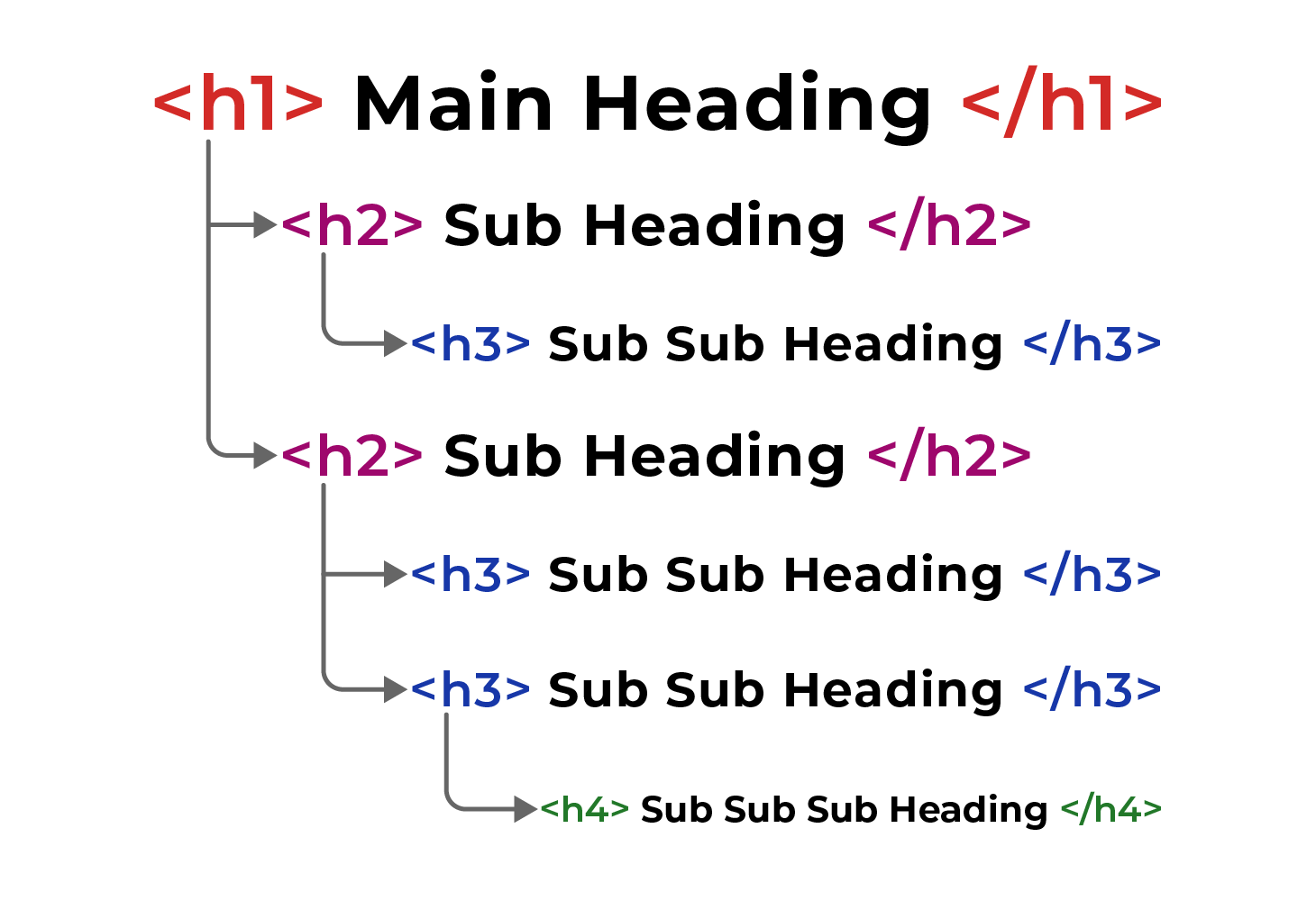
When coded correctly, users should be able to skip to the most relevant part of a page using headings alone - this is especially important for e-commerce sites.
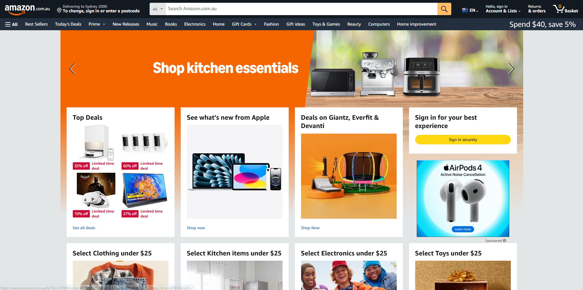
Adjustable Text Sizes and Responsive Design
Users should be able to resize text and use different devices without losing functionality.
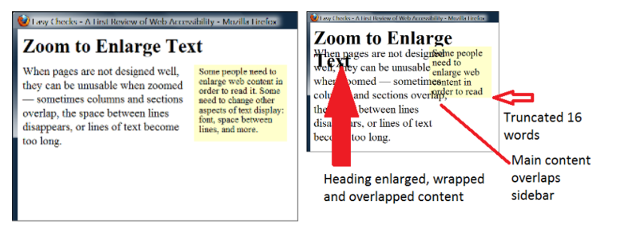
Source: https://www.w3.org/WAI/GL/low-vision-a11y-tf/wiki/Resize_content
In the right-hand side of the image above, we can see the impact of non-responsive text when the box changes size. The heading overlaps the main text, the main text also overlaps the sidebar text, and the side bar text is cut off at the bottom.
Tip
Content must be able to adjust naturally to different screen sizes without forcing users to scroll horizontally or zoom out. Websites must also support up to 200% zoom without breaking functionality.
Flexible units like em and rem instead of fixed pixels, allow content to scale proportionally across different screen sizes and zoom levels. This ensures that when users adjust browser settings or zoom, everything adapts while staying readable.
Where to now?
Prioritising accessibility in web and e-learning development isn’t just about compliance; it’s about fostering an inclusive digital world where everyone can participate equally.
If you would like further advice on how to improve accessibility, please contact our friendly team.


